Hey Web Developers.
I know we’re all about engaging our web site visitors and getting them to like, tweet, or otherwise drive traffic to your webpage, but can we talk a bit?
If you’re using the standard like button for your page, just check to see what your page looks like from a place that blocks social media like Facebook.
Here’s what i see whenever I try and read an article on TheVerge.
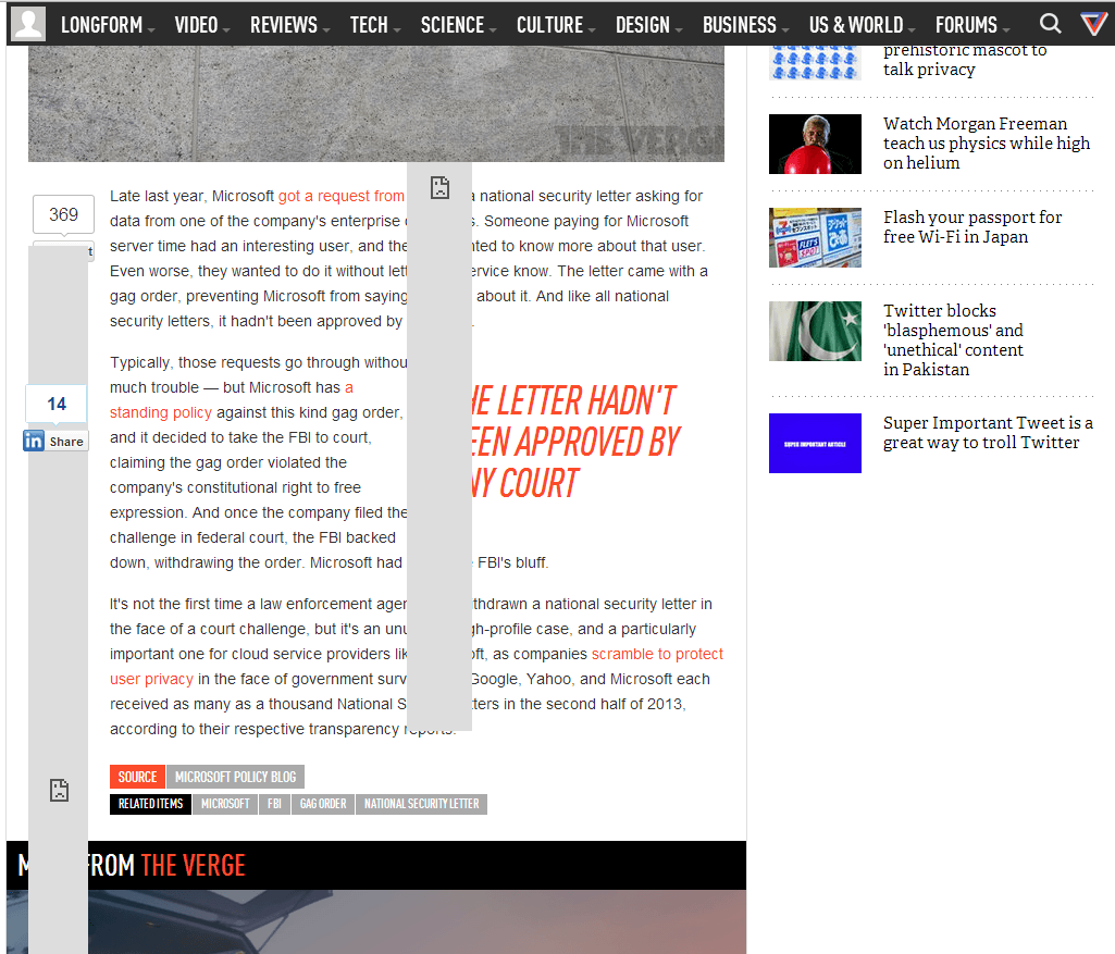
Notice: the huge grey bars covering the content? Those are poorly designed/implemented Facebook like/share buttons. They cover the meat and potatoes of the website: the actual content. It drives users crazy. More importantly, it drives people away from your site. Just because someone is at work doesn’t mean they shouldn’t be able to view your site and read the content.
Here’s what a normal implementation should look like:
Notice the difference? The Like button is there, visible. It doesn’t cover the content of the page. It doesn’t flow beyond the size of the actual button. Clicking it would result in a block page, as expected, because Facebook is blocked. It doesn’t affect the readability or usability of the page though. This is IMPORTANT.
The easiest way to fix this is to host the Like/Share button icon on your own web server. This way your users don’t need to install something like Facebook Blocker ( http://webgraph.com/resources/facebookblocker/ ) just to read an article.
Thanks!